Joachim Brohm: Places & Edges

From the moment you lay your eyes on the piece ‘On Fire’ by Joachim Brohm, you will forever be in its spell, that incessantly reaches to the deviant within us all. The Brancolini Grimialdi was again the source of my evenings entertainment as they launched the first ever solo exhibition in the UK of Joachim Brohms work.

Joachim_Brohm_On_Fire

The German has work spanning across his 30 year career showcased here, including pieces from Ruhr (1980-1983), Ohio (1983-1984) and more recently Culatra (2008-2010) series. The photos demonstrate his competence to replicate the pioneering approach of American photography greats like William Eggleston, Stephen Shore and Robert Adams. This influence and comparison is arguably due to him to becoming one of the first European photographers to capture what is known as the “everyday cultural landscape”

He began using extensively colour from the 1970s so all of the pieces here are in colour, but against the bright white walls of the Grimaldini it is a good thing. It is when you see the photographs from the Culatra series that focus on the Portugese island do you realise this. The colourful series focus on boats, tractors, shacks, backyards, facades and more, lying on perfect white sand. Nevertheless, in spite of the alluring white sand and blue skies, the island looks without doubt to be deserted, which portrays a completely different message. This gives these photos a chilling edge, as a feeling of abandonment and desolation of a once thriving community lies directly in front of your eyes.

 Joachim-Brohm-–-Tractor-1-from-the-series-CULATRA

The photographs of the Ruhr region in Germany are quite interesting as Brohm is able to portray the changing landscape of this region quite well, as he captures the edge of urban life. It captures the rural feel of the Gelesenkirchen and Essen regions and in doing so for me highlight the philosophy of documenting the ‘everyday cultural landscape’.

 Joachim_Brohm_Essen_1982

Though unsurprisingly his year long stay in Ohio, appeals to me most as his photographs clearly depict the bleakness of the Great Lakes States. The iconography of 80s America shines out from the amazing mise-en-scène as a different but gruesomely similar story. The tale is no where near the transience American Dream President Reagan’s would of had you believe.

 exhibition-ohio

This show runs till the 11th May.

Lifework: Norman Parkinson’s Century of Style

norman-parkinson

Fashion photography has always been a grey area for me, often was I caught off guard during my New York days, routinely would I end up looking like a wally by how little I knew. Though eventually I began to pick up names and one of those names was Sir Norman Parkinson, but it was not until I saw his own personal style did I become such a fan.

Often cited as one of the original masters of modern fashion photography, it would only seem right that to celebrate with an exhibition celebrating the centenary since his birth. The National Theatre, are the driving force behind this retrospective and they have pulled together a pretty captivating number of images. It spans from his early forays in the 1930s, until his death in 1990 working as a freelance photographers exploring his use of exotic locations and the weirdest props imaginable.

My attraction to Parkinson’s style throughout his work stems certainly from the core of his imaginative, unconventional and unique approach. As he stormed into the game he shook the dust off techniques of old, laying the guidelines with memorable quotes like ‘Any photographer who surrounds himself with a studio is doomed,’

Models Talking to Policemen

The National Theatre does a great job in presenting a fair and evenly weighted show, as there is not too many photographs hailing from one genre over another. I understand as a portrait photographer Parkinson should be famed forever, his natural ability at capturing many of the greatest icons of the 20th century is phenomenal. Some of the best shots include the likes of Audrey Hepburn, Wenda Parkinson, Ava Gardener, Vivien Leigh, Apollonia van Ravenstein, Raquel Welch, Iman & Jerry Hall.

Harlem Motorcycle Gang

Though again I was a sucker for shots of in and around New York as they had me pining for a city I still very much miss. I remember looking at the photographs of the Harlem Motorcycle gang and just being completely blown away. His natural ability to capture the essence of style shows you how he became one of the most renowned and innovative figures in British fashion photography. They evidently back up his credentials showing why he worked 55 years for publications in both Britain and America, including Vogue, Harper’s Bazaar, Queen and Town & Country.

Jpeg_3_2489506k

This show runs till the 12th May and is free, so it could be the perfect location for any whistle-stop tours down on the Southbank, perfect for those sunny days ahead.

Plane

Man Ray: Portraits

Last year I was fortunate enough to of been able to see some of the biggest art exhibitions that the United States had to offer, as I roamed New York and San Francisco seeing work from the likes of Cindy Sherman, Keith Haring, Rime/Toper, Kraftwerk and David Shrigley. Though one exhibition still stands out as being one of the best, and that was the Partners in Surrealism Lee Miller and Man Ray retrospective, which was on  at the Legion of Honor in SF.

The show was constructed of over 115 photographs, paintings, drawings and manuscripts all of which explored the creative interaction between the two giants of surrealism. It was the first exhibition that looked at the two exclusively and explored their relationship as partners in art and then later on in love.

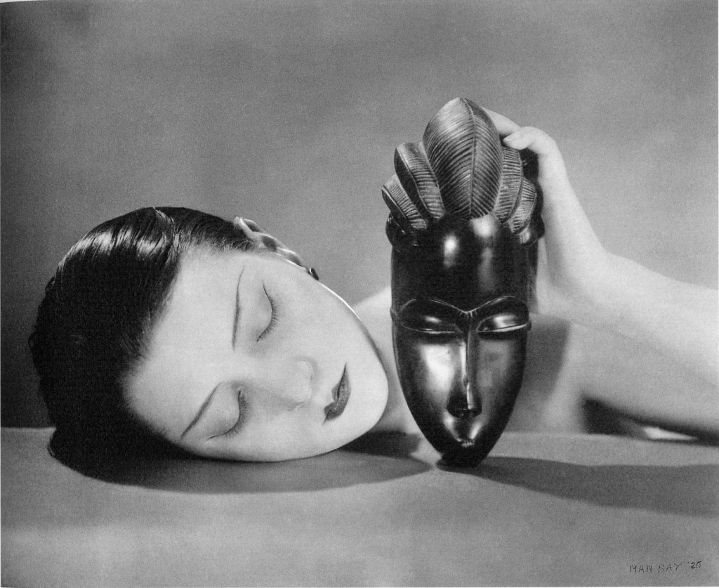
Man Ray ‘Tears’ 1933

Their mercurial relationship culminated in some of the most formidable works of both artist’s career, which then helped alter the course of modern art. The two artists inspired each other equally, collaborating on several projects together all of which are pioneering and raised the bar around the world. Although the two only shared accommodation for three years, this exhibition looked at the lingering effect they had on each others work in the years following. It surveyed the differing mediums they also chose to work within, as it meandered through the surrealists imagery in unanticipated ways, consequently producing astounding levels of imagination.

So when the NPG sent out their press release email informing me of the upcoming, Man Ray Portraits exhibition, I knew this was not too be missed. The all out Man Ray exhibit, is completely devoted to someone I personally see as the most innovative figure working at the start 20th Century.

The National Portrait Gallery have done a sensational job collecting 150 photographs and vintage prints from the great mans career during the years of 1916-1968. The portraits celebrate his contemporaries as he photographs friends, lovers and members of his highly esteemed social circle. The Philadelphia-born artist spent his early life in New York, turning down to study architecture in order to focus on his paintings…thank god.

The first portrait offering comes from 1916 and is of another favourite artist of mine Marcel Duchamp, the french avant-garde artist. It was Duchamp who acted as a inspiration for Man Ray during these years teaching him the ways of Dadaism, which got the ball rolling for the Surrealist movement and in turn Man Ray’s career. What I find most interesting is the fact that Man Ray originally took on photography to reproduce his own paintings, but then changed to produce photography in aid to financially support himself. I applaude the way he recognised the inflating boundaries of photography and acted upon them allowing him to procure respect for himself as an artist.

As the exhibition moves through Man Ray’s career the big names begin to roll in and there are some interesting portraits of the most famous people of his day. One portrait which caught my eye, was that of Ernest Hemingway as his stare is cold and forlornly in its manner.

Also portraits from this era include a glum, melodramatic James Joyce as he hangs his head and Arnold Schoenberg who looks a little worse for wear. What is interesting about these though is they are distinctively very un-Man Ray as they appear on the surface to be rather normal and mundane. It is as if these portraits could of been done by anyone with the technology to take a photograph, as the key components such as light and pose are hardly complex.

Nevertheless there is also portraits of arts giants with Picasso, Matisse and young Dali making an appearance, showing Man Ray’s early but influential social stimulus. This is for me is the changing point in his career and ironically in this exhibition. The photographs begin to become more outrageous, leading you to believe these meetings obviously had a key and lasting impression on Man Ray.

Lee Miller 1929

This period in Paris is probably my most loved phase in Man Rays career as he began to create photograms, which he called ‘Rayographs’. This process was created through solarisation of negatives and creates an image that for its time was insanely unprecedented and pioneering. I found the portraits done through this technique to be utterly mind shattering, not for their aesthetics but for the creativity of it all. The portraits int this era include the likes of Elsa Schiaparelli, Irene Zurkinden, Lee Miller, Suzy Solidor and his own self portrait.

Man Ray self portrait

This is an impassioned piece for many reasons, as it is not just a portrait of artist but it’s the portrait of an artisan, one who is hard at work. In my humble yet bias opinion it is this that makes this portrait so appealing, as it has a direct clear-sightedness and a emphasis on a craftsman in his natural element.

Man Ray ‘Le violon d’ingres’ 1924

One of the most interesting portraits for me nonetheless, is the 1924 piece entitled ‘Le violin d’Ingres’ which translated from French is a expression about a hobby.  It depicts the naked form of a woman who sits with her pear-shaped back facing us. Her head, wrapped in a turban, is turned to the left. The viewer’s attention is drawn not to her shapely profile but instead to the two black f marks (familiar to those on stringed instruments) on either side of her spine. The result is an archetypal Surrealist image that is strangely arresting, dreamlike, sexually charged, amusing and upsetting, everything surrealism should be. What I find the most enthralling about this piece is not its subject, world renowned Kiki de Montparnasse but its ironic and pretty churlish undertone. It is a well known fact Kiki loved to play with the violin, therefore when you take the markings on her back into account, you get the image that Man Ray loved to play with Kiki. Was Man Ray bragging about how much of a player he was? I would like to think he was. 

As war broke out, Ray left Paris for the bright lights of Hollywood, where he began working with some of Americas biggest stars and we begin to see portraits of stars such as Ava Gardiner and Paulette Goddard.

Ray returned to Paris later on in his life, 1951. The photographer like those he once photographed, had ironically become a legend, the subject of several books and exhibitions. It is therefore small wonder that Man Ray became the man he did and the fact his traits and techniques are still used with relative frequency in contemporary photography. Though always now considered as one of the greats for his expressive techniques, this exhibition made me realise something far greater, his workman like availability and his directness in the creation of his images. I think the portrait below says it all…A must for all fans of not just surrealism but photography and art as a whole, a true master explored.

Heidi Specker: Termini

Heidi Specker

The job of a photographer is a tough one, but to some it is sensational gift, making the mundane into something extraordinary. Heidi Specker is one of those people.

Brancolini Grimaldi has compromised a beautiful set of images, all ranging in their interests as Specker produces some images that look like they are close ups of a David Lynch set. The way she transforms surfaces of buildings into aesthetically pleasing photographs, is something I am still yet to get my head around. Yes I will grant that the toned shade of grey is bland, but its the way the photographs are shot that makes them beautiful.

The image, which is often a close-up, modifies spaces and proportions, isolating the subjects from the context giving them a whole new meaning, turning them into absolutes.

I have included some of the images from this show, which finishes on the 16th.

Celebration: George Parks.

07/03/06 is a date that should be remembered for it marks the anniversary of one of life’s true heroes and pioneers of the art world Gordon Parks (not to be confused with the Scottish striker of the same name) Parks was one of those rare talents who no matter what he set mind to, be it photography, film making, writer or composer he never failed to fall short of genius. His immense, largely self-taught skills chronicled the African-American experience, resulting in a document of works that mirror the story of his own fascinating life.

Parks humble beginnings were nearly his downfall as he had to overcome being born into poverty, prejudice and losing his mother during his teenage years. Surviving narrowly through his teenage years he was finally saved from by his nascent gift, which was both musical and visual. Starting out as a piano player in a brothel, his skill was blatant for all to see as he created a name for himself as being a world class pianist.

This lead him to Seattle, Washington where at the age of twenty-five he bought his first camera at a pawn shop for $12.50. Armed with his trusty Voigländer Brilliant he documented the ever changing world around him, to applause from the photography clerks who developed his film. He then moved to Minnesota to work with women’s clothing store owner Frank Murphy and it was then his photos reached the wife of Joe Louis. It was upon her instruction that he move to Chicago, where he set up his own portrait company and specialized in photographs of society women.

Parks work began to become well recognised as his raw talent was simply stunning, with his style and keen eye for detail being present in abundance. This presented Parks with the opportunity to become the first African-American to work as a staff photographer for Life magazine. It was here where he developed an incredible ability to present risqué subjects, constantly challenging the society in which he lived. For me his success at Life magazine, (which published from 1948-1972) shows how Parks used his camera to bring attention to subjects often shied away from by American audiences.

 It was his work during these years that put him at the forefront of the world as being one of the greatest humanitarian photojournalists of all time. His range of subjects made him a true great as his persuasiveness always allowed him to get the best from his focus. Parks specialized in his commentary of the life he once knew, one of black urban life rife with racism and poverty.

Gordon-Parks-Harlem-Neighborhood

For myself I feel as though his strongest and most passionate work comes within these years and it is these he will probably be most remembered. The photograph entitled “American Gothic” which lends its name from the famous painting by Grant Wood. The photo depicts a black woman named Ella Watson standing in front of an American Flag as she clutches onto a broom in one hand and a mop in the other. It is said to have been a representation of the racial bigotry and segregation Parks encountered while in Washington D.C. and shows just to the extent Parks was given free reign to show the world as it was.

His work in the Brazilian slums is also just as hard hitting, as he brought the favelas to Americans living rooms. His story on the plight of Flavio da Silva is sensationally grim, with the photographs telling the life of South American poverty with a real force.

Flavio

However, Parks also had more strings to an already impressive photography bow, as he also had an immense talent  when shooting film stars and socialites, due to his natural persuasiveness. Some of these images Parks did looking at celebrities and important figures are critically huge as he looks into the likes of Muhammed Ali and Malcolm X. The photograph below of Malcolm X is one of my favourite images of all time, as it shows him handing out newspapers with a headline explaining about a incident involving negro males being beaten by white policemen. The obvious disinterest from the white patrons walking past the store he stands outside is just indicative of the time Parks and Malcolm X both experienced on a day to day basis, and really represents a nation in racial turmoil.

pn_3013_Image_NPG_98_81-T

In the 60s he began to meander into writing, where he produced his memoirs, novels, poems and screenplays, which led him down the track to making one of the greatest films ever made. In 1969 he directed the Hollywood movie “The Learning Tree” which is a film based on his own life and semi-autobiographical novel of the same name. The movie is also shot in the actual town he grew up in and is an interesting insight into 1920s Kansas, where racial discrimination was just the social norm.

The Learning Tree

It however was not until 1971 did he announce himself on the movie scene when he directed and wrote the smash action movie Shaft. Since then Shaft has been garnered with award after award, with the New York Times naming it one of the best 1000 movies of all time further cementing the genius of Parks and his domination of all mediums.

Throughout the rest of his life Parks continued to work with the camera and writing as he carried on documenting the world around him. His productivity however, slowed but the quality of his work did not dip, and right until his death in 2006 he was still one of the most recognised figures across a whole host of mediums. All in all for me he is probably the most important photographers of all time and when you couple this with his incredible film making/writing it becomes plain to see just why this man should be remembered.

R.I.P Gordon Parks

The 5 “Wonders” of Tate Britain…

The second I walked into the TATE Britain I pretty much felt more out of place than a goth in Abercrombie and Fitch. The moment you enter, your ominously greeted by paintings of Edwardian Generals and sketchy Bronze sculptures too unappealing to be stuck in some park, or in some posh twats garden in Kensington. However, there are some saviours and in this I will reveal my own personal saving graces as I cautiously explored the “wonders” of the lesser known Tate.

David Bomberg-Mud Bath (1914)

1) The first came in the form of audacious painter David Bomberg who I until this glorious moment was unaware. Approaching the painting was like stepping into some sort of world far beyond our realm, similar to taking some hallucinogens, as his treatment of the human figure using angular, clear-cut forms give off a tremendous vibrant energy. It is a painting that jumps off the wall in a room full with frankly what I consider to be extremely bland pieces.

The way in which Bomberg is able to reduce the human figure to a string of geometric shapes truly fascinates me. I could not quite put my finger on why I enjoyed looking at this for so long but when thinking further, I came to the conclusion that it’s the simplicity. When you consider the painting at a raw level, it seemingly represents the human form, stripped to its essential core quite literally. The scene is of a steam bath near Bomberg’s home at the time in east London, which were dominantly used by the local Jewish population. These baths though were not just places for physical bathing and had hugely religious associations, which left me asking the question of; “Is it physical or spiritual bathing they are after?” I guess only Bomberg and the Jewish population of the early 1900s can answer that though.

Mark Gertler “Merry-Go-Round” (1916)

2) The second work I found most interesting was Mark Gertler “Merry-Go-Round” (1916), another painter until this point I was completely unenlightened too. A genius who lived and worked in Hampstead Heath, and it is here where he would of most likely attended the annual fair, which is the focus for a few of Gertler’s paintings. Merry-Go-Round has a seemingly playful tone, as one would usually associate the playground attraction with pleasure, but its until you explore Gerlter and his works more, you become aware of the political outcries.

The piece was painted during the height of the war in 1916, just after the Government introduced conscription for men aged between 18 and 41. Though Gertler thanks to his Austrian parentage, could not serve and was thus given a free pass to satirise the militarism that surrounded him. Standing at a cool 6ftx4ft , the frozen mid-spin carousel, shows the mouths of its uniformed riders clamped open in a terrified scream. It is from these expressions one can really see Gertler’s true expression, which is his strong disapproval for the war, as he turns something of joy and entertainment to a metaphor for the military machine.

Sonia Boyce “Missionary Position II”

3) My third saving grace I had heard of, as it graces my bedroom wall (well a postcard of the piece does) and comes in the form of Sonia Boyce’s “Missionary Position II” and is probably one of my favourite artworks of all time. I think my affinity with this particular artwork could be because Boyce remains a massively inspirational figure in my life as she manages to portray so much while giving away so little. I firstly find the piece awfully attractive in the aesthetics, but its the message Boyce subtly portrays I find so awe inspiring. The proficiency of Boyce in her capability to pin point the black woman as a force of resistance and redesign always leaves me wanting more. This is one of the most paramount statements found within the whole of the Tate for me, as she opposes the stereotypical mute acquiescence, which often found in a lot of works past and present especially in the depiction of the black female.

Lubaina Himid “Between the Two My Heart is Balanced” (1991)

4) As I continued to look around the Tate I was confronted with the work of Lubaina Himid and her beautiful “Between the Two My Heart is Balanced” (1991) In this dramatic portrayal two native African women sit in a boat with a traditional cloth between them, which consists of a pile of maps, charts and books. Its implications are however, quite severe, far from the utopic calm scene first recognised. But the fact these women have these documents is immaterial as they destroy them, seemingly demolishing the tools used by their oppressors as they sail between Africa and major slave ports. It is a scene that examines the constant battle for survival of African culture despite the intervention of colonialism.

Another captivating factor about this piece, is the poignancy to the Victorian artwork of the same name by James Tissot. Though there are extreme differences in both their messages, obviously and it does not take a genius to see what they are.

Christopher Richard Wynne Nevinson The Soul of the Soulless City (‘New York – an Abstraction’) (1920)

5) The fifth is another artwork from one of the Vorticism heavyweights, C.R.W. Nevinson. What drew me to this painting originally was the title “Soul of a Soulless City”, as it brought back emotional memories of my own personal experience in New York. It transported me back to some particularly macabre and gruesome moments of my time in the big apple, which did nothing to discount the soulless label given by Nevison. I remembered a “strange” woman in a mobility scooter who was blatantly doped up shouting at another “strange” creature, as he had supposedly stolen her hair cut money (likely story, hmmm) while drug dealers strolled the street, counting endless bills and flaunting huge gold chains.

Though it did make me think of the other side of the city, as it reminded me of standing at the Marcy JMZ, waiting for the train to Manhattan before going over the Williamsburg bridge and being greeted with the exquisite views.  The painting shows an imaginary section of the elevated railway running through what looks like Manhattan, as the tracks seamlessly blend and merge into the cities metropolis. The gracefully slim chromatic range of dominantly brown and grey, make the skyscrapers go a long way to showing off its Cubist nature. However, the central motif of the railway line retreating suddenly into a mass of tower blocks goes a long way to epitomising Nevinson’s futurist interest in speed, technology and most importantly modernity in a ever changing period of industrial history.

Though described by one American art critic as being ‘hard, metallic, unhuman’ I could not really disagree more. I think on the other hand, maybe this is because my own experiences of this great city have perhaps clouded my judgement making me lose sight of the true spirit (or lack of) within New York.

STEALTH WEAR!

stealth-wear-burqa2-multi1

As fashion weeks around the world begin preparing and collaborating with designers about their shows, there is one trend I guarantee you wont see, Drone Stealth Technology.

The man behind this genius is the wonderfully talented Adam Harvey, whose work continues the fascination of thwarting the technological tools of the oppressive surveillance state. He is known for his previous work such as the CV Dazzle, where the goal was to be able to camouflage yourself from face recognition systems, both digitally and physically.

So this new collection of “counter surveillance garments and accessories” named Stealth Wear, shows that Harvey has again managed to loophole supervision on the public by those who surveil. Though this latest collection is a collaboration with the New York born, London based fashion designer, Johanna Bloomfield.

The pair aptly launched the items in London, a city that is constantly under surveillance from the beady eyes of CCTV. The clothing range is ‘anti-drone’ in a number because the items reduce certain factors used by police and government outlets in tracking suspects.

The first and probably most important function of the new range, is its ability to reduce the appearance of body heat into a thermal imaging camera. This is obviously key as we all know the importance of Thermal Imaging to Police helicopters when chasing ‘scum on the run’. However, in Stealth Wear all of your body heat is reflected, so when you wear it, you appear to be cloaked. This is achieved by creating the material from nylon, coated in silver at the level of the fibers, which then allows the heat to be trapped inside the garment therefore not appearing on the camera.

Though they also offer the user more than just thermal protection as it has an ‘Off Pocket’ pouch, which immediately disables phone signal. This is key for covering signal tracking and the authorities triangulating your movements, limiting the users traceability.

Finally also the ‘XX Shirt’, the shirt with the ability to protect your heart from x-ray radiation. However, the last one maybe best used away from your local airport for obvious reasons, but still could be a very useful garment.

Overall these garments may seem slightly farcical and outrageous but ones that raise valid social issues within contemporary society. The notion of drones keeping a watch upon us from the skies is a scary prospect, but one that is not too far into the distant future, so its about time we all strapped on some surveillance stealth gear and hit the street.

“In privacy we trust”- Adam Harvey

More Strange Hungers….

sh_googles_940px
A Brooks Art in unison with the WW Gallery are proud to exhibit More Strange Hungers a solo show of recent and new works by the marvellous Sadie Hennessy.

More Strange Hungers is the result of a rich seam of work that first formed whilst Hennessy was assembling the works for her solo show at WW Gallery. That show aptly named, Strange Hungers, took its title from the eponymous 1963 British Pulp Fiction book. The book is famous for its exploration of the mysterious workings of desire and the insistent lusts and cravings of sexual appetite. When you then compile Hennessy and her unique message to this you see the genius of the whole show as the playful look at the slippage between repression and expression, decorum and disarray.

Hennessy works across a number of different mediums to explore a catalogue of what she believes to be “insatiable” hungers, including lady lust, mother love, the fear of female sexuality, the vapidity of pornographic imagery and the exploitative sensationalism of gossip mags. It is strangely fascinating therefore, when you break it all down and both her humorously camp commentary on British cultural values and her critical examination of their changing status become visible.

Consistently outrageous, Hennessy subverts familiar imagery in an observational wit fest which boldly goes where it probably ought not to. Described as “Sensational Super Charged and Salacious” it delivers on all fronts as in More Strange Hungers, Hennessy continues to deliver her humorous, wry, feminist manifesto and a celebration of female empowerment and sexuality. Her hybrid collages and assemblages create unsettlingly surreal combinations and are delivered with a wicked sense of humour.

This show runs till the 23rd March.

shsh12

RIME/TOPER at Klughaus

toper_1
‘Snap Back—Dangerous Drawings About New York’ Highlights Some of the City’s Best In Street Art (via Downtown Magazine NYC)

For repeat readers, it might not come as any surprise that I’m once again spouting praises of the Klughaus gallery, but they’re continually hitting home runs, it can be fairly easy. Snap Back—Dangerous Drawings About New York, which opened on the 15th of this month and runs till New Years Day…

Continue reading

Jurne-Keys to the City at Klughaus.

12oz-jurne_12


http://downtownmagazinenyc.com/san-francisco-graffiti-artist-jurne-on-exhibit-at-klughaus/ 

The Klughaus is one of my favorite art galleries and is one that always brings bangers to the people. Well, their latest show is nothing different as they welcome San Francisco’s Jurne to showcase his latest works.

The exhibition entitled Keys To The City is a solo exhibition by the California whizz that strikes a delicate balance between abstract contemporary designs, traditional graffiti lettering and calligraphy.

Keys To The City is an excellent display showing how the acclaimed graffiti writer is able to transition from the large-scale pieces he usually does on the street to smaller, fine, artier works. It demonstrates the ability and adaptability of Jurne as he shows a combination of text -based collage paintings, as well as showing off his talents through geometric calligraphy.

The geometric calligraphy is particularly impressive, as the vellum Parisian maps become the basis for his work. These were collected from a recent trip in 2010 to France and remind me of the map work created by the guys who recently exhibited at Pure Evil.

Also on exhibit is a beautifully insightful look into the work of Jurne, through a collaborative video with fellow Bay Area videographer Leo Bruno. This is the product of the past few years working together and gives you a rare opportunity to get into the nucleus of Jurnes’ creative mind. This is amazingly insightful and inspiring, resulting in a comprehensive knowledge of his approach and lifestyle.

I fastidiously recommend that everyone check this out as it’s a perfect example of how a gallery and artist perfectly in synch can take something so critical within the street and thrive in a  gallery. The work is top quality, but it always is at the Klughaus.

Keys to the City runs until December 1 at Klughaus gallery, located at 47 Monroe Street, New York, NY, 10002